Inspiration from Info We Trust #029
A stunning new train travel visualization PLUS a big start for the California map Kickstarter.
🚆DUTCH RAILWAY TRAVEL
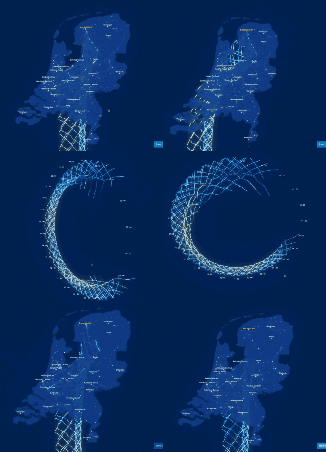
The below GIF previews an interactive visualization of Dutch Railway travel across a normal weekday. It begins with trains zipping around the country's geography. Twisting the view reveals that the ghost trails of each train's travel is etched in 3D space. A 24-hour cycle is revealed, showing no activity in the middle of the night.

This work was published earlier today by Jan Willem Tulp on Twitter. Tulp is an interactive data experience designer based in The Hague, Netherlands (website).
The piece presents dense data with a powerful visual metaphor: the trains are running around a clock. It is all skillfully packaged in a fluid experience and exciting aesthetic. You can play with the interactive at Dutch Railways by visiting this site and expanding the window.
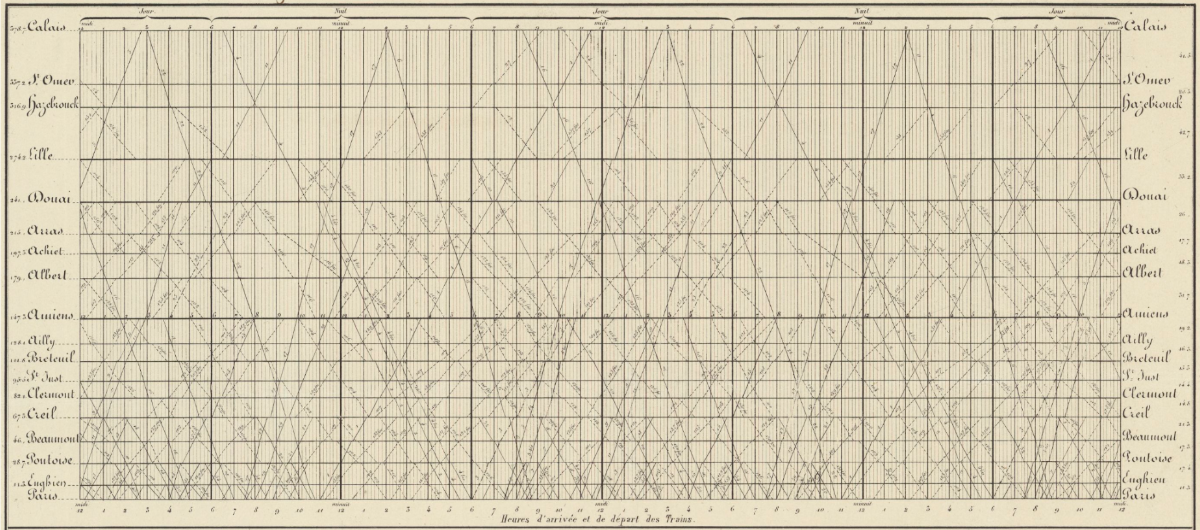
Showing space and time in the same view is an eternal challenge. Minard solved it elegantly when he marched Napoleon to Russia and back. Ibry visualized train schedules as early as 1847 (1852 example from BNF below). But Ibry had to compress geography to a single dimension: stops along the train line run the vertical axis.

As of today, dynamic digital design allows us to have it all: time, two dimensions of geography, and all the train lines.
🗺 CALIFORNIA MAP UPDATE
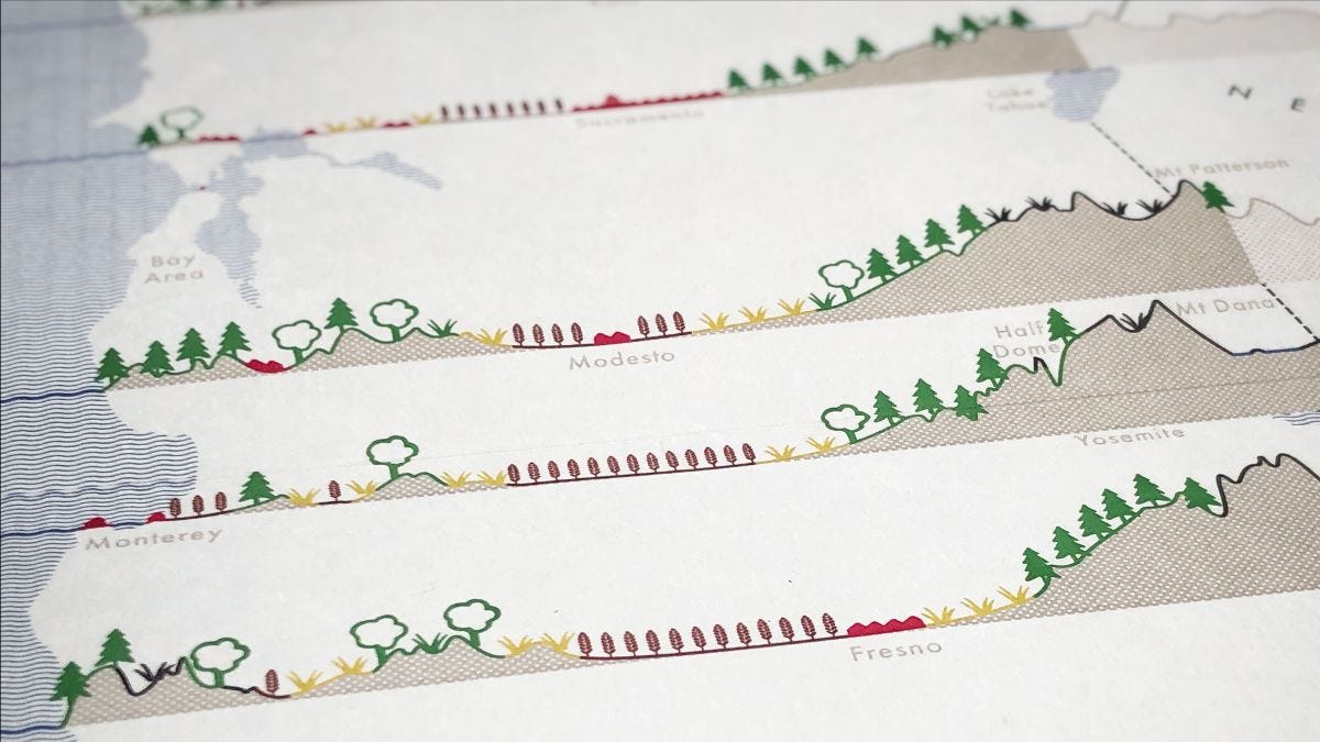
Thank you for all your enthusiasm since the launch of the crowd-funding campaign to print Cross-Sections Through California. At the moment we are 77% funded. How extraordinary!
Please do support soon: there are limited Kickstarter-priced rewards still available.

Onward! -RJ
Like inspiration? See more at Info We Trust:


