Analysis and Anarchy
Or: there’s gold in them thar charts!
In this edition of Chartography: two plugs for upcoming events AND THEN a new way of studying inspiration. Let’s go!
🗓️ I am appearing LIVE! in conversation with Rob Saunders at the Letterform Archive to discuss “glorious data graphics.” It will be an evening of insights and delights from the world of information graphics. The event is both in-person and virtual (and free!)—let’s pack the room:
📓 I will teach Principles of Data Graphics via Cooper Union’s public workshops, which are available to anyone wishing to build their skills and knowledge base. It’s an original six-session virtual class of my own design.
We will dissect the elements that make charts and maps spectacular. Each session will focus on a specific aspect of information design, ranging from choosing effective visual metaphors to visualizing uncertainty to the subtle art of color-encoding. Throughout our critiquing and making, the emphasis will be on the hard human decisions necessary to create effective data graphics.
Tue, February 20 – Tue, March 26, 2024, 5:00–8:00 PM ET (2:00–5:00 PT)
The workshop will fill fast. Register now to get one of our limited seats:
Analysis and Anarchy
As an information designer, I've always been fascinated by the power of visuals. In our recent double-shot edition, you've seen some of my favorite inspiring gems, charts and otherwise, that capture this fascination.
In practice, like most designers, I assemble reference collections for each of my projects. This journey of assembling reference collections for each project has been more than just a professional routine; it's a personal voyage through a world of creativity that continually shapes my taste as an image-maker.
An associative memory of stuff I like, and being pretty good at finding it when I need to see it again, has gotten me this far.
Recently, a review copy of Alli Torban’s new book, Chart Spark (Data Literacy Press, $22.95 Amazon) helped me recognize that I do not cultivate any kind of analytic practice concerning my inspiration. Maybe that should change.
Before we discuss inspiring charts, let’s address favorite images that are not data graphics. Torban would classify these as energy inspiration. I have these in a big folder and prefer to look at them sorted by color with an ancient program called ImageSorter.
Maybe you recognize some of these thumbnails! Beyond my color-explorer, the only extra thing I do is add reference links and attribution to the image’s metadata so that future-me can track down more details when he needs them.
Torban would classify charts as practical inspiration—artifacts from your own field. I don’t have an equivalent folder or Pinterest board or anything else collecting my favorite digital data graphics. They live scattered across projects and bookmarks and tabs.
But maybe there is another way to structure this content? For practical inspiration, Torban advises we question why a piece has caught one’s eye. She formulates the process with an acronym:
X—What got me excited about this graphic?
R— How is it following the rules?
A—How is it throwing out the rules? Where is the anarchy?
Y—How might you use it in your work?
To try this method out, let’s apply it to a few recent charts that caught my eye, but aren’t the aesthetic darlings that would elevate them to be energy inspiration.
Exhibit A
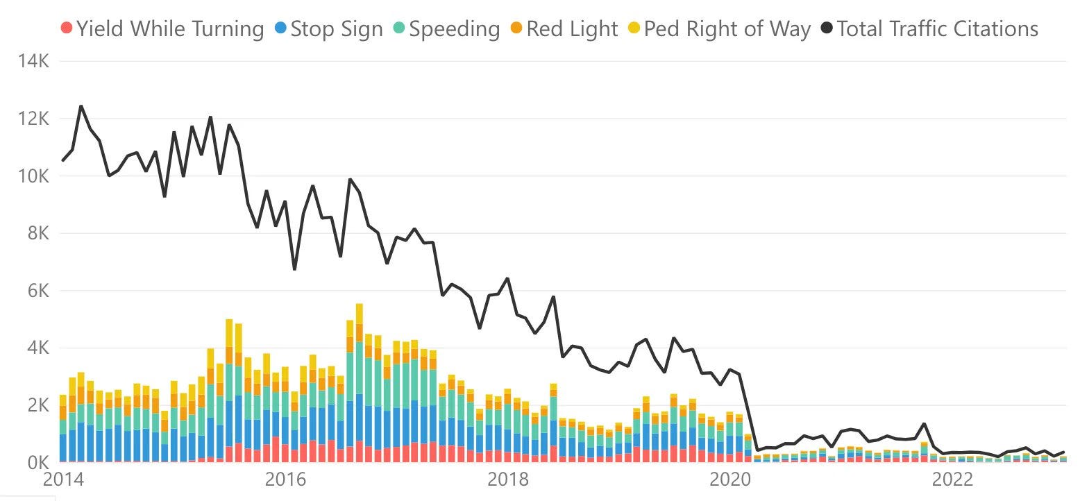
The first chart, below, is from the City of San Francisco (link). Its original policy purpose has been usurped by the way it shows the collapse of SF traffic citations. Take a look and then let’s XRAY it.
X: What got me excited about this graphic? At first this chart is all about feeding my outrage. I live on a busy San Francisco street plagued by drivers unable to see stop signs. The chart makes my frustration feel recognized. But there’s something else exciting about this graphic too: The contrast between its colorful stacks and thick black line is visually arresting and immediately draws my eye.
R: How is it following the rules? This chart is following its Power BI template, perhaps to a fault . . . axes and color labels could be better.
A: How is it throwing out the rules? Where is the anarchy? Here, the chart gets spicy. The colorful bars do not stack all the way to the total because the chart does not detail every type of traffic citation. The gap between the stack and line is weird! Also, note that the color red is for yield, Not stop. Not red light. That’s anarchy!
Y: How might you use it in your work? I like the color contrast here. It’s a good reminder to seek new ways to create contrast because contrast is what the brain pays attention to.
Exhibit B
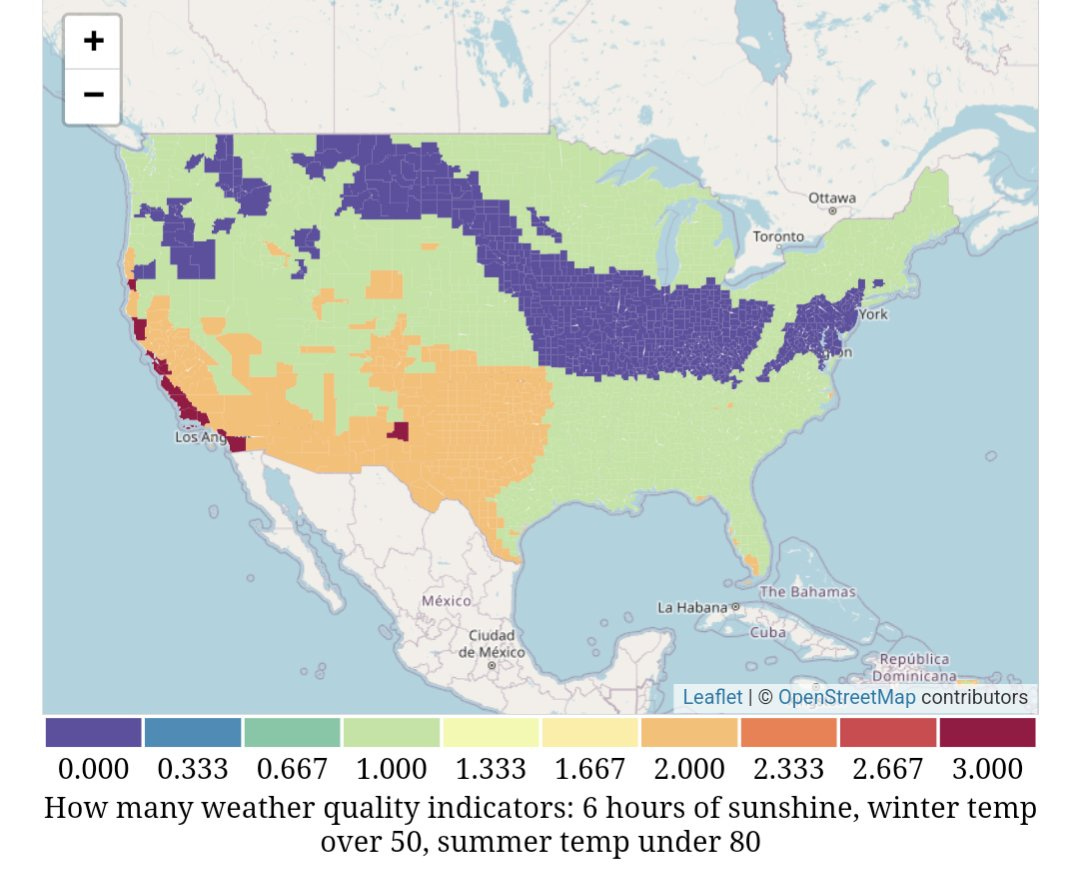
Our second specimen is a county map from Urban Stats (source). It is colored to show how well each place measures against a livability criteria: not too cold, not too hot, lots of sun. (Basically, a formula for California.)
X: What got me excited about this graphic? Once again, this graphic’s story speaks to my identity as a Californian. Further, baking the year’s weather into a single user-determined score is a cute way of compressing all of that complexity into a very simple visual. With that simple visual, we get to see some neat patterns. (Hello Appalachian Mountains.)
R: How is it following the rules? Once again, not much here for me to learn from.
A: How is it throwing out the rules? Where is the anarchy? I like how the state borders are removed. It invites you to figure out where the break points between colors are, and tests your knowledge of American geography. The chart is more interactive because it is missing a common reference layer. (These colors could also be considered anarchy.)
Y: How might you use it in your work? Try eliminating more than you normally would.
Exhibit C
Our last victim is from the Pew Research Center (source). Take a look and then let’s XRAY it.
X: What got me excited about this graphic? Despite this being a very busy composition, my eyes immediately went to the modern clusters that stretch from FDR through Trump. You can circle the blue and red presidents without any overlap. Interesting! Democrats are relatively young and Republicans are relatively old. (And then came Biden.) Next, I saw the narrow age range of our first half-dozen presidents, in gold. Interesting!
R: How is it following the rules? I like how this uses a bunch of color values. There are different greys, which makes its packed format legible. Similarly, multiple values of gold, blue, and red give the chart depth and texture, including helpful annotations of president names.
A: How is it throwing out the rules? Where is the anarchy? To focus your attention on age at inauguration, the chart does not color the full terms of each president. But it does connect first inaugurations to second inaugurations, which has the effect of coloring plenty of first terms. Is that anarchy? (Also, check out the numbering on that timeline. Why 1805?)
Y: How might you use it in your work? This chart shows me that you can pack a lot of detail into a tiny image with artful color design.
As we journey through the world of data graphics, it's clear that there's much to learn from the interplay of aesthetics and analytics. As John Tukey wisely noted, 'If we want to learn more, we must think more.'
Our natural fast-thinking attention is great at recognizing interesting charts, but it can take some slow-brain analysis to recognize why a chart works. Consider Torban’s XRAY method to learn more. And go read her book, it’s great!
Next issue, we will return to our series on 1930s TIME magazines, with a focus on some amazing in-house information graphics. I’m so happy you are all here for the ride.
Onward!—RJ
About
Data storyteller RJ Andrews helps organizations solve high-stakes problems by using visual metaphors and information graphics: charts, diagrams, and maps. His passion is studying the history of information graphics to discover design insights. See more at infoWeTrust.com.
RJ’s recently published series, Information Graphic Visionaries, a new book series celebrating three spectacular data visualization creators. With new writing, complete visual catalogs, and discoveries never seen by the public. His first book is Info We Trust, How to Inspire the World with Data., is currently being remastered for a new edition.


