


Collage your charts
How to avert dueling axes.

Welcome to Chartography.net — insights and delights from the world of data storytelling.
🥳 San Francisco’s Letterform Archive is hosting a party for my book launch March 20.
🤓 Rumsey Map Center at Stanford University is hosting a Friday afternoon event for my book launch Friday April 4. (We also have a morning practicum open to Stanford faculty, staff, and students—message me for details.)
📖 Order your copy of Info We Trust directly from Visionary Press.
From the department of joyful factoids: The telephone area code for Brevard County, Florida, is 321. It was assigned to Florida (instead of suburban Chicago) after a successful local petition to commemorate the Space Coast’s countdown: 3-2-1-liftoff!
It remains the only known area code assigned for a thematic reason.
Collage your charts
“Dual axis” charts add a second scale to overlay a data series with different units. It’s a nifty way of seeing how two curves align (or not).
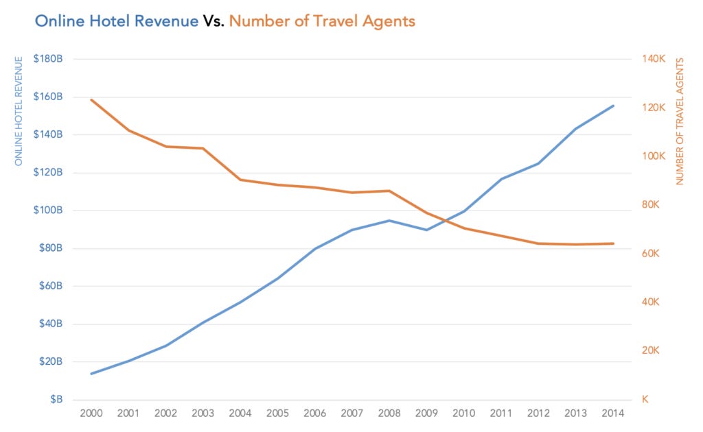
We mostly steer clear of this practice, however, because it can generate meaningless artifacts. For example, the intersections between lines—such as the one above around summer 2009. These graphic hallucinations are products of how the left and right scales are calibrated, not the story in the data.
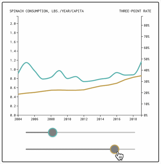
This point was splendidly illustrated by Nathan Yau in his new essay “Defense against dishonest charts.” See how changing the righthand scale alters the relationship and interactions between two curves:
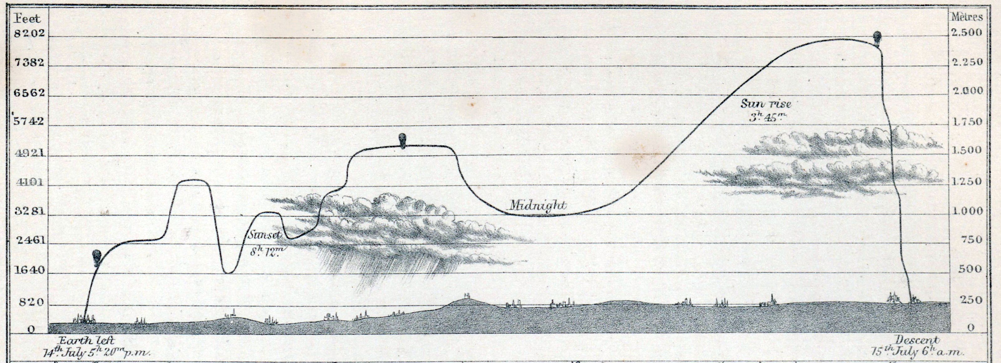
Yau advises against using double axes “unless the second axis is a direct translation of the first, such as metric and imperial units.” My favorite example of this exception is James Glaisher’s balloon elevation charts. They list both feet (left) and meters (right) above sea level. They are dual axes, but not dueling.
But what if the problem isn’t that two is too many, but not enough?
A recent Ed Hawkins chart incorporates not two, but eight separate axes on the same canvas. Here is a detail showing the modern “instrumental period.” link
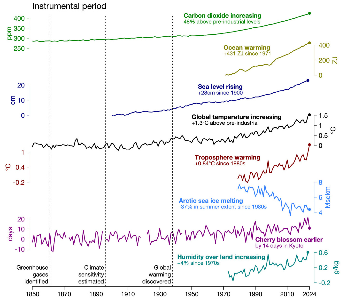
The composition wisely places each curve so that they do not overlap, avoiding unwanted graphic hallucinations. To my eye, the effect is overwhelming in a tremendously effective way: Look at all the indicators moving together toward their terrible fate.
Eight curves sharing the same timeline isn’t so much about graphic efficiency or even seeing the curves synchronized, as much as it is about enhancing the total impact of the marks. It wouldn’t be the same as a small multiple. The connective tissue would be lost in the wall of eight bricks.
Chart collages seem like a choice form to illustrate a theme that has both distant and overlapping parts.
It’s not a new idea. Here’s a detail of John Russell Sowray’s “Chronological, historical, and statistical diagram” (c.1860), which you may recognize from our Marey volume.
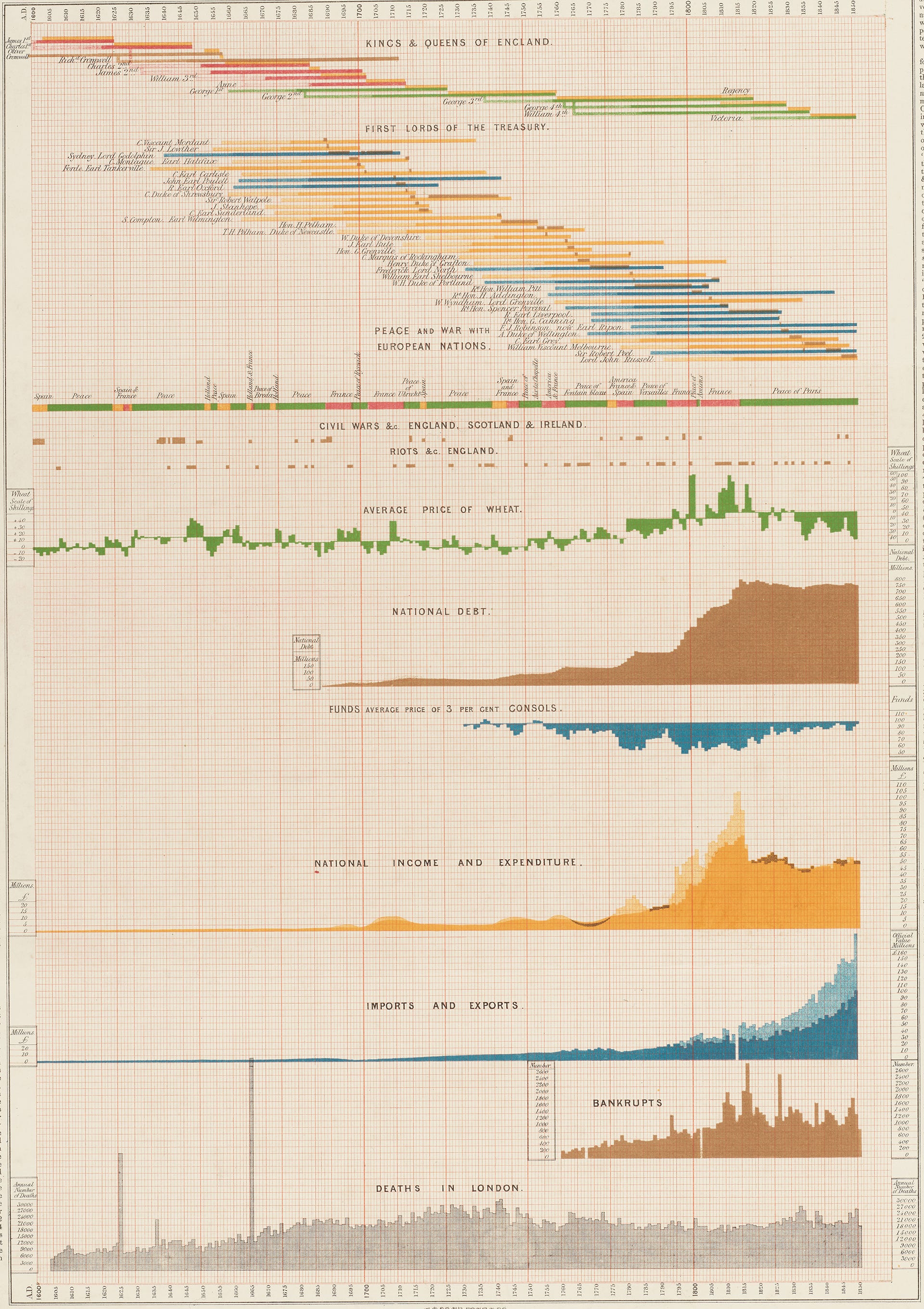
A little later than Sowray, chartographers like Arthur Scaife might have called this approach “synoptic” for its ability to summarize the general view of the whole.
It’s a form I’d like to see more of. Send me your favorites.
Onward!—RJ
About
RJ Andrews helps organizations solve high-stakes problems by using visual metaphors and information graphics: charts, diagrams, and maps. His passion is studying the history of information graphics to discover design insights. See more at infoWeTrust.com.
RJ’s next book, Info We Trust, is currently available for pre-order. He published Information Graphic Visionaries, a book series celebrating three spectacular data visualization creators in 2022 with new writing, complete visual catalogs, and discoveries never seen by the public.
What a nuanced breakdown. Nicely done RJ!
One thing that strikes me on the Ed Hawkins viz: I am actually not sure the secondary axes were needed. He could have used % of change for each it probably would have worked just the same, more like small multiples with a shared x axis. I might be wrong but that chart still feels quite cluttered and hard to read to me.
Fascinating idea. And that Ed Hawkins chart is a masterful example. Imagine revealing that on a meeting room screen, coloured line by coloured line...