Joyful Infographics
Unpacking the exuberance of Nigel Holmes
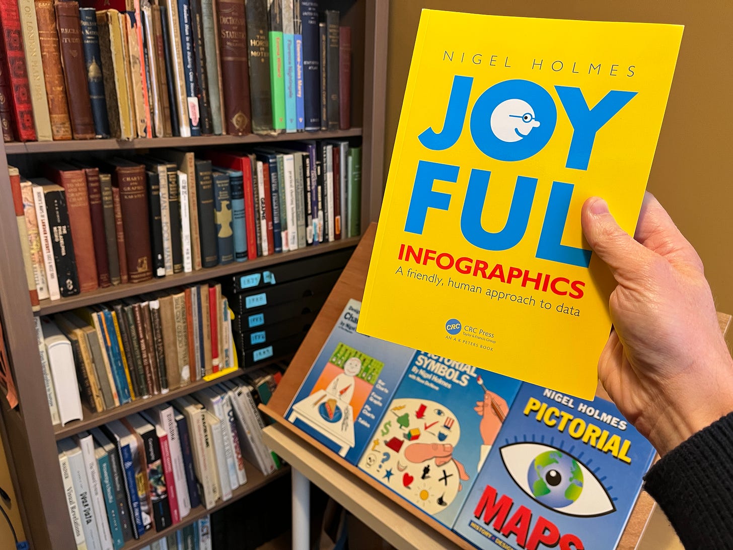
Nigel Holmes has a new book out, called Joyful Infographics, a friendly approach to data. I read it over the holidays. It’s a real treat.
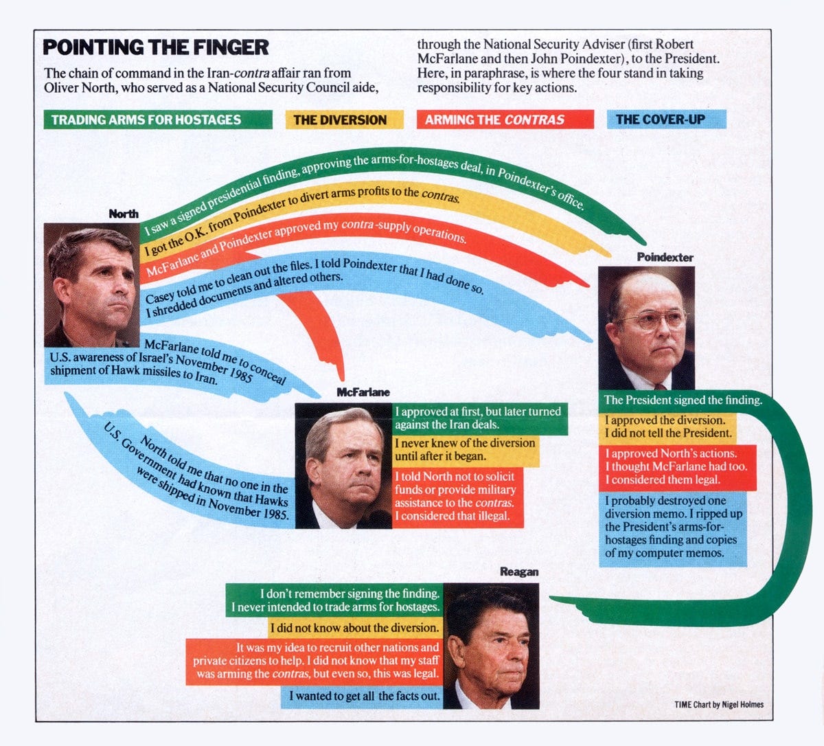
Nigel Holmes is celebrated for colorful chartoons made while running the show at TIME magazine. “Pointing the finger,” below, is one of his favorites. It reminds me about how much power good arrows can produce if designed with care.
His 1984 book, Designer’s Guide to Creating Charts & Diagrams, contains a chapter that reveals how he made these—from “initial problem and receipt of data to the finished graph, chart, or table.” It’s one of my favorite pieces on the craft of information graphics.
The new book will tell you the whole story and a lot more. Along the way you will encounter many delights. Here’s a taste of what got me excited to make better infographics:
The book begins by inviting you to do some light stretching, complete with diagrams and encouragement (“Try it now!”). It’s the perfect beginning. Light, surprising, friendly. In a word, joyful. In two words, Nigel Holmes.
No other information designer beams with character as Holmes does. His playful enthusiasm bubbles through his talks, shines through his infographics, and makes me smile every time we chat. His enchantment with the world sparkles. To read the book is to enjoy his cheerful company.
In a section on visual metaphors, Holmes lists the images he now avoids. The batch includes roller coasters, mountains, horizons, ladders, telescopes, icebergs, and hour glasses. Each one is overdone, and no longer delivers the punch they used to. The list reminds me about the power of employing fresh visuals if you want to spike a mental picture.
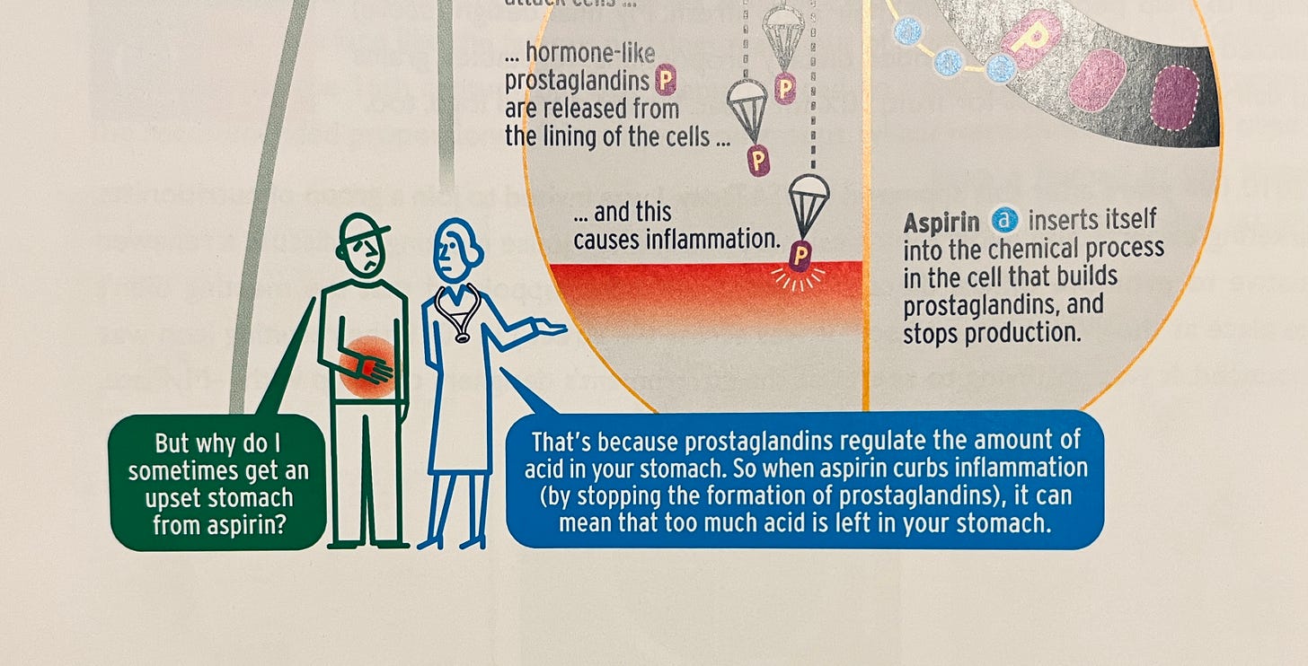
Many of Holmes’s infographics include little cartoon people on the periphery, making some wry observation in speech bubbles, packing in another layer of annotation (and fun). “They are breaking the fourth wall, by addressing the reader directly, outside the chart itself.”
He calls his little people a kind of “Greek chorus” after the company of actors who comment on the action in a classical Greek play. Now I want to try my hand at casting a chorus in my charts too.
I hope to see a Nigel Holmes stage performance in-person. He puts on a good show, complete with life-size horse models and rising weather balloons. Looking forward, we all have an opportunity to return to in-person happenings. Let’s make them worth it. Let’s make them joyful.
Across two hundred pages of glee, Holmes gets stern only once. In a he critiques the recent emoji-customization bonanza. Holmes cautions us about tailoring tiny pictures to every individual: We are losing the power of symbolic images. “Regardless of the color of our skin, or hair, or haircut, or sexual difference we are all PEOPLE first. . . . They are no longer symbols when there’s so much pictorial detail in them.” His solution for some cases: Use a simple emoji font, like Noto Emoji, and make everyone blue. I’ve already started doing this and I like it a lot.
Like his 1984 book, Joyful Infographics ends with a clever appendix that serves an expresso-shot of delight. I can’t read it for you—go enjoy it yourself!
Onward—RJ
Notes:
I received a review copy of Joyful Infographics. Nigel Holmes is also a supporter of this newsletter, hi Nigel! 👋
Jennifer Daniel, Chair of the Unicode Emoji Subcommittee, wrote about similar issues related to emoji customization in a recent newsletter:


