
Poking the Robot
Our first round pressure-testing machine-learning models.


Welcome to Chartography.net — insights and delights from the world of data storytelling.
🥳 Letterform Archive is hosting a party for my book launch March 20th in San Francisco.
🤓 Rumsey Map Center at Stanford University is hosting a Friday afternoon public event for my book launch Friday April 4. (We also have a morning practicum for Stanford affiliates.)
📖 Order your copy of Info We Trust directly from Visionary Press.
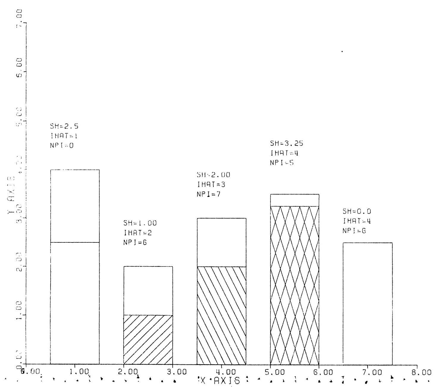
Fifty years ago, data graphics began a bumpy transition from analog to digital. The historic heights achieved in print were mostly abandoned in favor of primitive computer graphics.
For example, here is a stacked bar chart from a 1979 thesis explaining how to use the CalComp plotter:
Over the following decades, our field progressed. It reclaimed some previous analog victories. It also bagged new peaks, such as pinch-zoom maps, real-time visualization, and scrolly data journalism.
While digital charts have had recent profound impact on the public (politics, pandemic, protests, etc.), technical progress has plateaued, with no significant innovation in our software or libraries in several years.
That’s all changing. Today, a sudden phase shift is underway across technology. It would be foolish to think that machine-learning models are not coming for data graphics too. We can hear the whitewater ahead. But will the rapids be big? Fun? Or disastrous?
We’re curious about these new tools, and how our field can use them in productive ways, such as improving charts and democratizing their creation. But we are not so naive to think that any benefits will just happen.
Let’s scout ahead, and see how we might best paddle these exciting waters. We took a simple first step: Let’s learn how well the machine can read a chart. We are excited to share with you today that the robots surprised us in many ways.
To begin, we chose the following stacked bar chart from The Economist. Please take a moment yourself and see what you can gain from your own reading.

We chose this example because it was relatively simple, with just enough narrative and design sophistication to give a reader something to chew into.
To take part in this journey, which of the following do you think the robots achieved?
(A) Throw an error reading the PNG
(B) Accurately interpret the horizontal-axis
(C) Correctly identify the scale and type of the violations surge
(D) Identify the publication that created the chart
(E) Teach us relevant context about military weapons
Did you make some predictions? Great. Let’s go!
After showing the robots the chart, we asked them a question:
How would you explain this chart to somebody who can't see it?
We say robots, plural, because we tried this activity in parallel with two advanced models. Since the point of this exploration is to probe machine learning generally, and not compare specific models, let’s refer to them by codenames: Salt and Pepper.
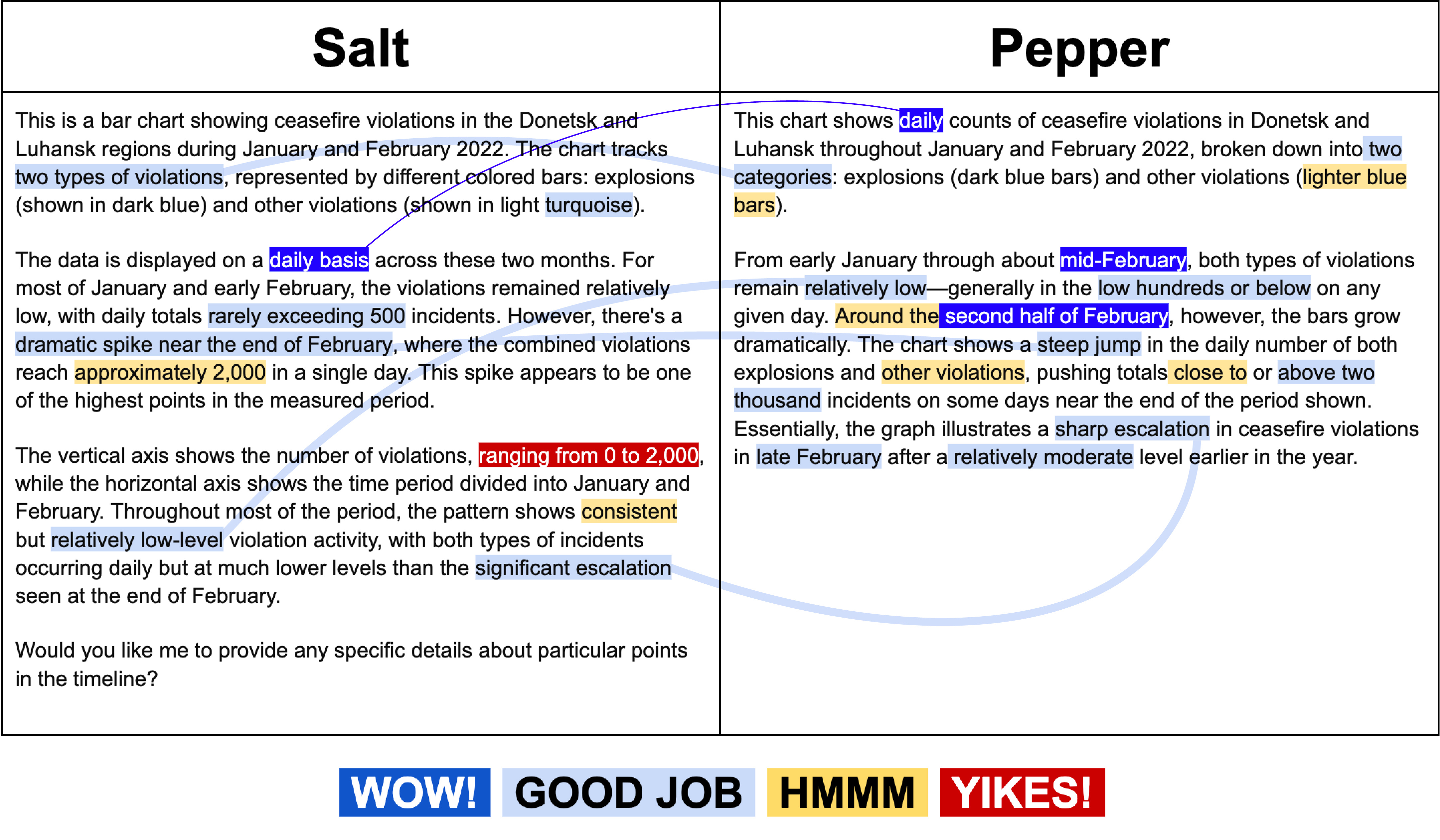
Below is how Salt and Pepper responded to our first question. We highlighted key passages to indicate specific impressive, interesting, and disappointing performance. We also connected similar feats between the two models.
Going into this experiment, we had no assumption that either model would be able to coherently process the image. Neither did we assume either would even recognize it as a chart. We were stunned seeing such detailed answers.
But this awe did not last. It’s amazing how fast we habituated to their amazing power to read charts, and swung into critique.
We were impressed that both Salt and Pepper correctly read the horizontal-axis time scale, successfully interpreting that each column represented daily counts even though only the months were labeled. They understood the relationship of the title to the chart, correctly applying the title's description to the meaning of the vertical-axis (cease-fire violations). Both models also recognized that there was a spike or escalation in late February. Pepper gave a concise and accurate summary as its final sentence.
On the other hand, Salt mistakenly conflated the max value of the vertical-axis (2,000) with the max value of the data. And, both models struggled with extracting accurate numerical estimates from the chart. They weren't fully "wrong", but also weren't right.
For example, Salt gave "approximately 2,000" in a single day where we would expect a human to say "over 2,000" in a single day. Pepper claimed that there was a steep jump in *both* explosions and other violations; yet the notable jump was specifically in the daily number of explosions.
Each model is also spaghetti hedging—saying a lot in expectation that us humans will pick out the useful bits. (This is a general problem with these models and not something related to data graphics.)
Neither model picked up on the subtle encoding in the horizontal-axis ticks: long ticks to separate months and one short tick to mark the end of the data series. But honestly, we didn’t notice this detail at first glance either. Without understanding this difference, you might interpret that the chart includes all of February, which isn’t true.
Overall, we thought the models warranted further probing. We decided to push them to see how much they could offer analytically with our next question:
Thanks, that's very interesting. Please analyze this data.
We were impressed that both models called out the significant spike near the end of the time period, and correctly identified that there is also a shift towards more explosions compared to other violations.
In lieu of showing you their full responses, we will summarize the highs and lows of how Salt (257 words) and Pepper (368 words) answered.
Interestingly, both models also introduced significant context that wasn't part of the chart, offering for example: Eastern Ukraine, critical period just before the major escalation, breakdown in the ceasefire agreement that had been in place, this uptick aligns with widely reported international tensions escalating, coinciding with Russia's larger-scale invasion launched on February 24th.
Robot-provided context is quite useful, if you trust it.
Both models introduced some interpretation of the observed data from a military context. Salt describes the data suggesting "a deliberate intensification" while Pepper describes the shift to explosions as a surge in "heavier, more intense forms of conflict" compared with the baseline's "lower levels of fighting - likely small arms fire, single shelling incidents, or other routine skirmishes.”
Are these details true? Presumably, but should we check it? How would we check it? It is easy to assume the models are probably right when the stakes are low, but this may be a foolish habit to fall into.
Pepper particularly called out cautions and context in interpreting the data. It noted the chart "only shows raw frequency of violations-- it doesn't directly measure their intensity" and then goes ahead to offer that "the actual impact on the ground… is not presented here, but could be inferred to have increased.”
Both models struggled (a bit surprisingly) with numerical comparisons. Salt confidently claimed that the spike was a "400% increase" and that "the ratio between explosions and other violations remains fairly constant during the lower intensity period". The 400% isn't necessarily wrong, but is very sensitive to how the "pre" and "spike" values are calculated. We would not describe the ratio as fairly constant.
Salt also struggled to summarize the relationship between explosions and violations in the pre-period, claiming wrongly both that they are "somewhat balanced" and that "explosions often appear to represent a significant portion of the total." Pepper misleadingly claimed that violations reached "around two thousand incidents on some days" when in fact only two days surpassed 1,000 violations and only 1 day appears above ~1600.
We found ourselves descending quickly from "wow! These models can read charts!" to being disappointed in how they missed the mark. Because they can read the charts and convey their responses in confident language, it's *so easy* to just believe what they say. Spotting their failures was not automatic. We had to rely on our own relatively deep experience reading charts to spot their errors.
After this data analysis, we were curious to learn how Salt and Pepper understood the chart from an information design perspective. We asked:
What particular design choices were made constructing this chart? Please identify and critique them.
Despite both models interpreting the data so well in previous questions, they both claimed that the two classes were shown, not stacked, but side-by-side. So disappointing.
Beyond this aberration, most of the design critique was reasonable, things like “the creator chose a bar‐per‐day layout, with time running along the horizontal axis.” They each grouped their design analysis into practical categories, including: color and contrast, scale and axes, time representation, and data density.
Several notes were surprisingly astute. For example, Salt identified that the more intense color was used for the more intensive type of violation (explosions). It also suggested that adding annotations could help explain key events. Pepper observed that the minimal x-axis labeling makes it harder to pinpoint exact data.
To our absolute shock, Salt identified the chart’s publication, “This appears to be from The Economist, which is known for its clean, information-dense visualization style, and this chart follows their typical approach of prioritizing clarity and functionality over decorative elements.”
Our final question asked Salt and Pepper to suggest an improved title for the chart:
This has all been really interesting, thank you. One last thing—Can you write a new title for this chart that both engages the reader and conveys the main point?
In response, Salt failed miserably. It over-explained its reasoning before offering three inappropriate titles, citing the previously mentioned dubious 400% and a pre-surge peace that was never there.
We were much happier with Pepper’s efficient suggestion and use of alliteration: “From Quiet Tensions to Sudden Surge: Daily Ceasefire Violations in Donetsk and Luhansk (Jan–Feb 2022).”
What did we learn going through this exercise?
We quickly flipped from I can't believe AI can read a chart—this is mindblowing! to frustration whenever they struggled with a particular detail.
It was tempting, so easy, to believe what the models said about the data, especially when it gave historic and military context to what the chart was showing. That ease of trust is perhaps why it’s so important to have high expectations with their output.
While it's tempting to use this exercise to evaluate which model is better, these models were mostly similar. Salt (Claude 3.5 Sonnet) and Pepper (ChapGPT o1) were not that different in terms of what they noticed, where they struggled, and how they introduced outside context.
Questions abound for each model. How would its analysis have differed with a data file? What if it had been given a messier chart or dataset? Would it have found this story? A different story? Treated the data summaries differently (more accurately?)? How does it perform with other chart types? More unique chart forms? What if we train a model specifically to interpret data, interpret charts, or to create charts?
How can we best use machine learning to create better charts and use data to inform our actions? We must learn more.
Onward!
Zan and RJ
Answer key: the robots recognized the PNG as a chart (A), surprisingly failed at C, and successfully accomplished B, D, and E. At least, we *think* the weapons context for E was accurate, we didn’t double check. 😉
About
Zan Armstrong is a data visualization specialist who changes how people look at their data (literally) -- leading to deeper understanding and discoveries, sparking new data-driven questions, and enabling better decision-making. zanarmstrong.com
RJ Andrews helps organizations solve high-stakes problems by using visual metaphors and information graphics: charts, diagrams, and maps. His passion is studying the history of information graphics to discover design insights. See more at infoWeTrust.com.
RJ’s next book, Info We Trust, is currently available for pre-order. He published Information Graphic Visionaries, a book series celebrating three spectacular data visualization creators in 2022 with new writing, complete visual catalogs, and discoveries never seen by the public.
 | A guest post by
|
this is great! it was a nice touch to use the prompts as headings in the article too.
on one hand it's a little weird to ask these data crunching pattern findings machines to take the long way by reading a chart rather than the data directly, on the other hand charts are a key way for humans to communicate patterns effectively with each other. having machines be able to use the same medium, speak the same language, does have its appeal.
the overconfidence thing is definitely an issue in this space, and hopefully something that will get better in general as post-training improves.