Prepare Yourself. Charts are coming.
Seeing that salute reminded me of two gruesome graphics.
Welcome to Chartography.net — insights and delights from the world of data storytelling.
📖 Most early editions of Info We Trust are on their way to readers (or already arrived). Please contact me with questions if you do not yet have your order details by email.
🥳 Letterform Archive is hosting a party for my book launch March 20th in San Francisco! https://letterformarchive.org/shop/info-we-trust-book-party/
🍎 My next Cooper Union data graphics class is about to sell out. If you don’t get in please make sure you join the waitlist as we will privilege that next time. https://coopertype.org/events/principles-of-data-graphics-2
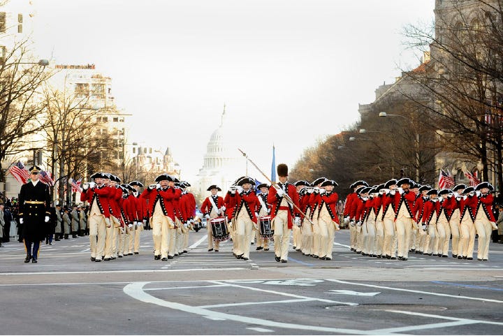
My favorite part of any U.S. presidential inauguration is watching the new Commander in Chief review the “old guard”, an active Army regiment that marches with cocked hats, muskets, and a fife-and-drum band, .
Here’s a shot of the band taken by my sister Elizabeth during an Obama inaugural parade.
The spectacle reminds us of the first president and our revolutionary origins. It also suggests the journey since, during which we’ve mostly enjoyed a peaceful transfer of power and an enormous expansion of people’s welfare. There’s a lot to celebrate on inauguration day, even when it is not your candidate taking the oath.
Today’s D.C. ceremonies were forced inside by cold weather. The move did not foster much patriotic pageantry for the zeitgeist. Instead, its singular triumphant piece of media was a video of the richest man in the world excitedly delivering the “Roman salute”—a gesture associated with fascism and especially the Nazi party. It has nothing to do with what Americans can be proud of.
Seeing the salute reminded me of a pair of gruesome data graphics.
The first was preserved as an exhibit at the Nuremberg Trials. It shows the “executions of Jews carried out by Task Force A.”
The second is also a statistical map. Its black sectors reflect the percentage of housing destroyed during the war.
There are two lessons. Superficially: extremism, especially fascism, inflicts enormous suffering, abroad and at home.
But the second is that data graphics thrive in bad times. Many of our field’s sacred cows chart death. Plague, war, and economic chaos all produce dramatic graphs that demand attention.
Prepare yourself. We are in for a lot of charts.
Onward!—RJ
And if you want to learn more about charts at the Nuremberg Trials then read:
About
RJ Andrews helps organizations solve high-stakes problems by using visual metaphors and information graphics: charts, diagrams, and maps. His passion is studying the history of information graphics to discover design insights. See more at infoWeTrust.com.
RJ’s next book, Info We Trust, is currently available for pre-order. He published Information Graphic Visionaries, a book series celebrating three spectacular data visualization creators in 2022 with new writing, complete visual catalogs, and discoveries never seen by the public.


May you live in interesting times - and the monkey paw curls.