This Chart Kills Fascists
Information graphics from the Nuremberg trials
Thanks for reading. Chartography is an ad-free newsletter completely supported by readers like you. The best way to support my work is to buy my books and become a paid subscriber.
Watching Masters of the Air on Apple TV+ sent me down a rabbit hole reading about the remarkable bomber pilot “Rosie” Rosenthal. After the war, he notably served as an assistant to the U.S. prosecutor at the Nuremberg trials, interrogating key figures like the former head of the German Air Force, Hermann Göring.
The Nuremberg trials, held by the Allies against the remnants of Nazi Germany, were pivotal in establishing legal precedents for prosecuting war crimes and atrocities. The Wikipedia article on the trials includes this sentence (emphasis mine):
Besides legal professionals, there were many social-science researchers, psychologists, translators, and interpreters, and graphic designers, the last to make the many charts used during the trial. [Wiki]
The mention of graphic designers creating charts for these trials was irresistible catnip for me. I had to see these charts.
Data visualization is often at its best when humanity is experiencing the worst. As Covid-19 recently illustrated, many will pause to understand a line-graph tracking the neighborhood death-toll of a raging communicable disease. Likewise, many of the sacred cows of data visualization (Snow’s Cholera, Nightingale’s Mortality, Minard’s Napoleon) display death.
The role of information graphics during the Second World War is underappreciated. From influence propaganda to secret plans to battlefield operations to the survival of persecuted peoples—graphics were a consistent element throughout the horrible ordeal. Despite their pervasive use, it's surprising that no single chart or format from this period has become iconic.
In exploring archives related to the Nuremberg trials, I uncovered a range of graphics that, while only a fraction of the evidence presented, reveal the immense scope and seriousness of the proceedings.
Next you will see a portion of the graphics I found browsing archives related to the Nuremberg trials. Given the most serious nature of the topic, literally crimes against humanity, I must front them with some caveats:
I believe most of these photographs originated from the U.S. Army Signal Corps. I found them chiefly via the U.S. National Archives and, to a lesser extent, the U.S. Holocaust Memorial Museum—and have repeated their original captions with some details in brackets.
I believe these charts represent only a tiny portion of the immense scope of the trials. I will only provide brief commentary because I do not know enough to give them proper context, nor am I able analyze the value of their impact to the proceedings.
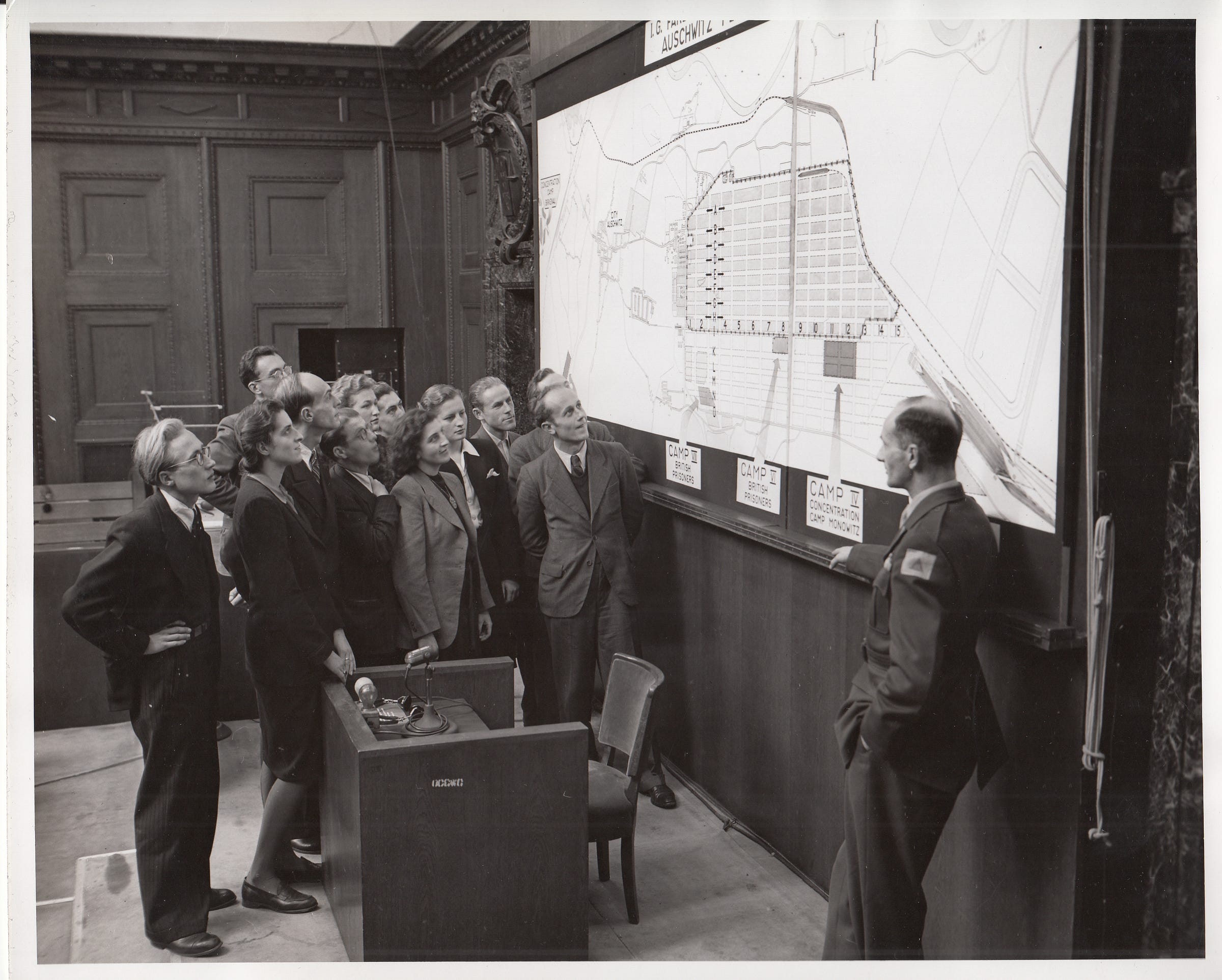
The thing that is most striking about many of these graphics is their immense size . . .

. . . and prominent central position in the courtroom.
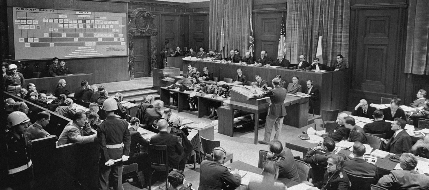
Many of the largest charts are org charts, which seem to place defendants and explain Nazi command and responsibility, such as in the below “Position of Kaltenbrunner and the Gestapo and SD in the German Police System.”
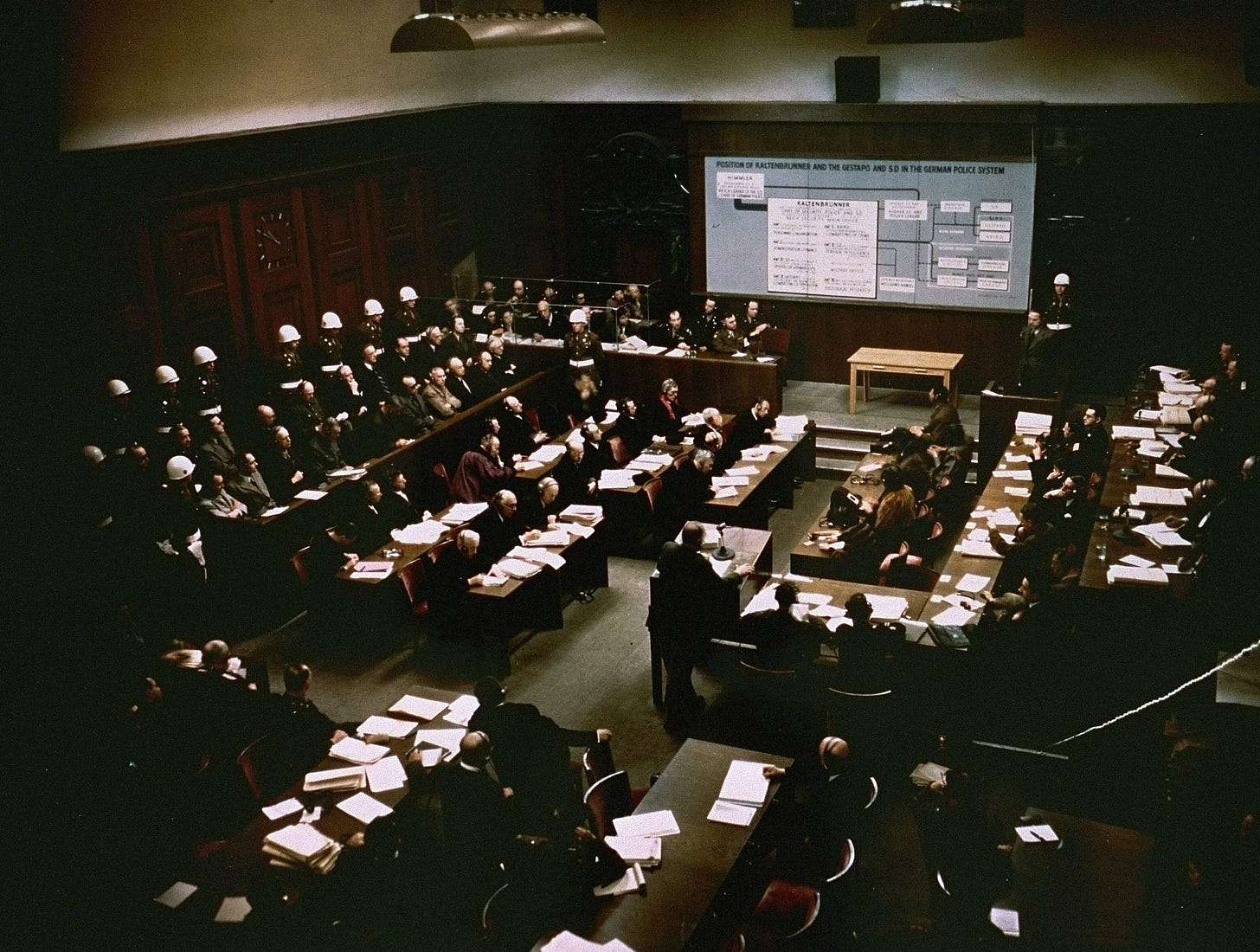
Ernst Kaltenbrunner was a major perpetrator of the Holocaust. He was the third Chief of the Reich Security Main Office (RSHA), which included the Gestapo. Kaltenbrunner was the highest-ranking member of the SS to face trial (Himmler having committed suicide in May 1945) at the Nuremberg trials, where he was found guilty of war crimes and crimes against humanity, sentenced to death, and executed by hanging on 16 October 1946.
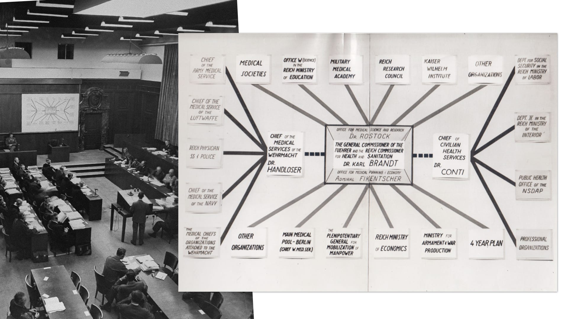
The below collage places Dr. Karl Brandt, who was convicted of human experimentation and other war crimes, sentenced to death, and hanged on 2 June 1948.
The quantity of summary charts I found paled in comparison to the number of photographic evidence. Below, the two formats are collaged.
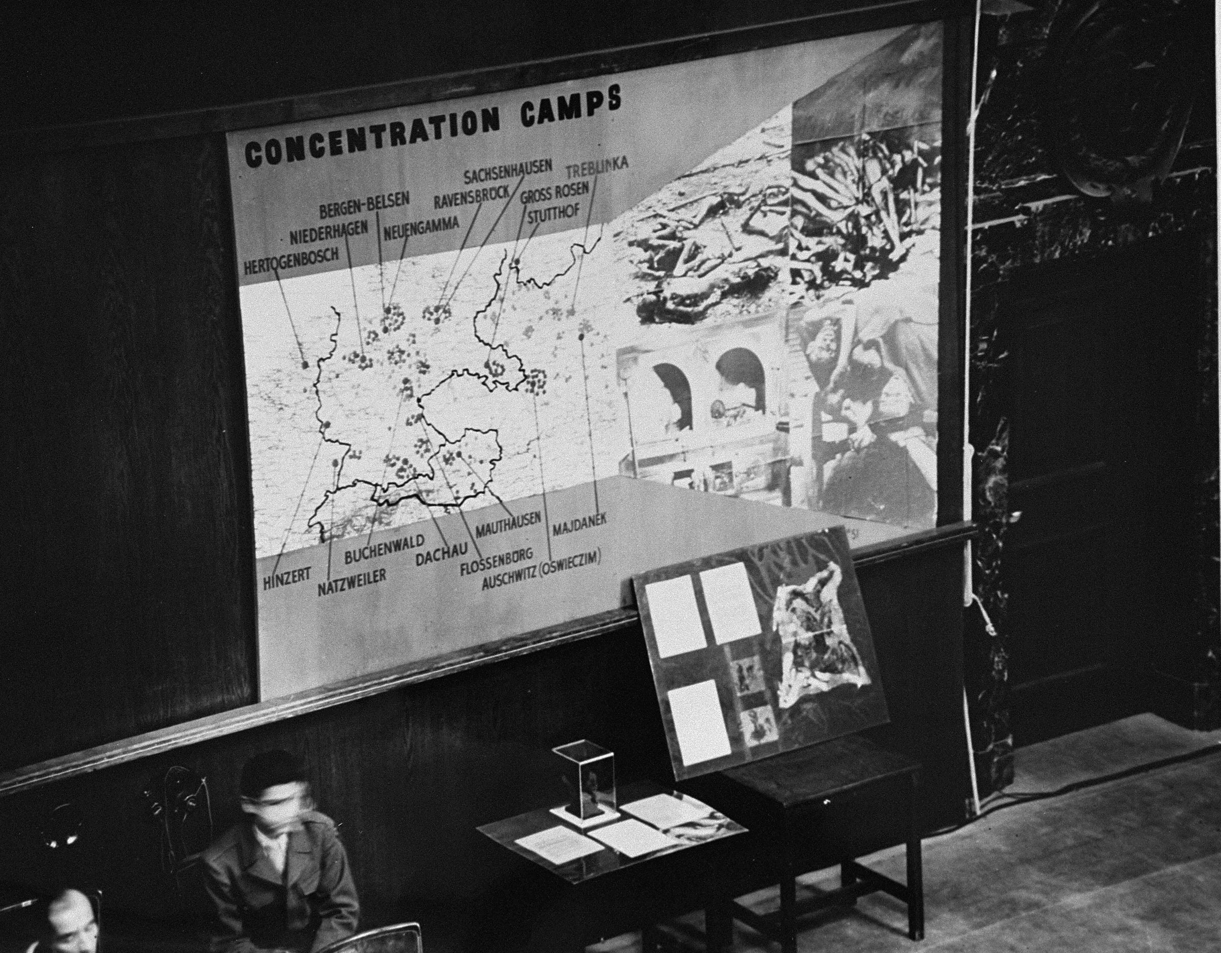
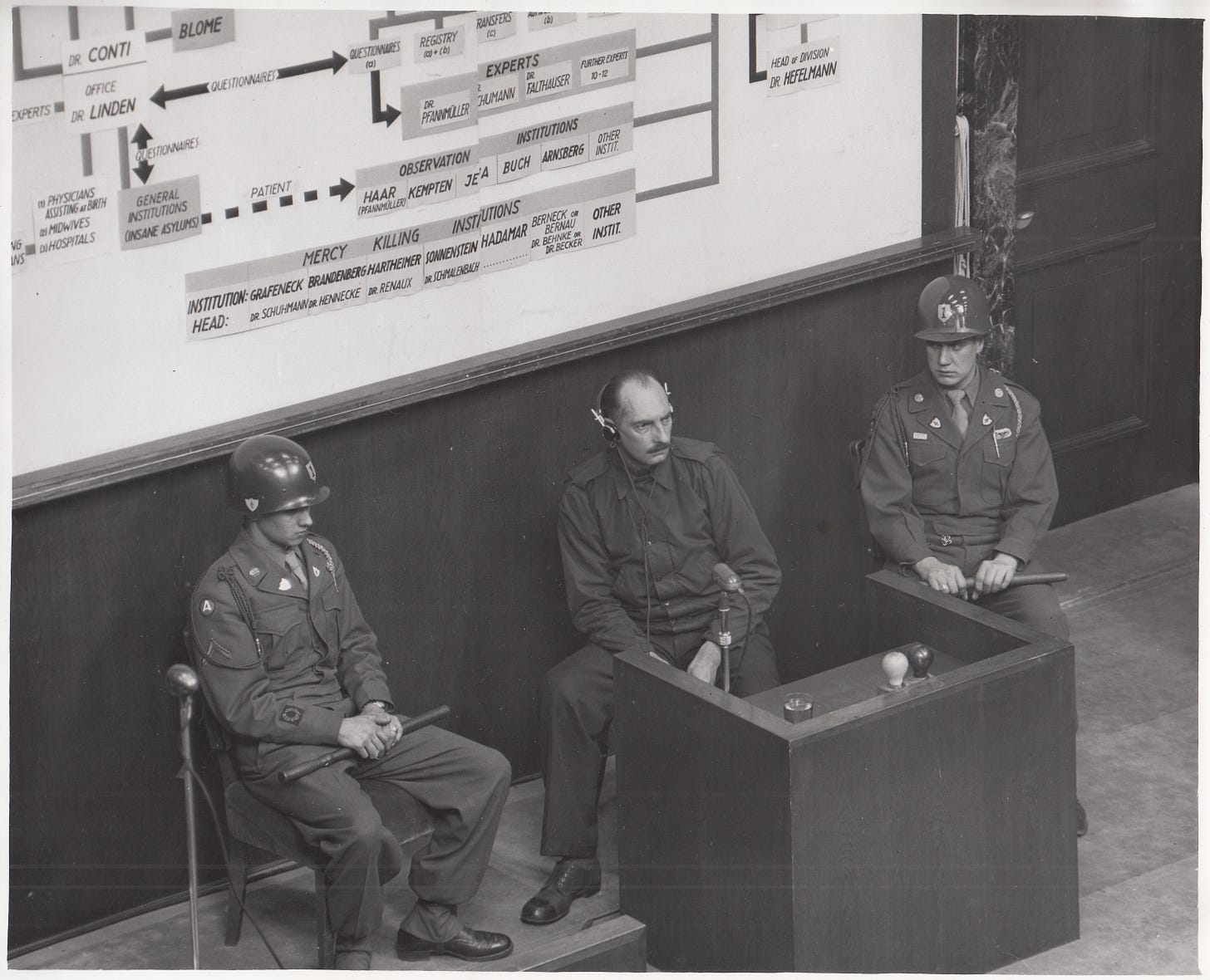
I find that the graphics are also powerful backgrounds for portraits of the various participants in the trials . . .
. . . including staged portraits in various prosecutor’s offices.
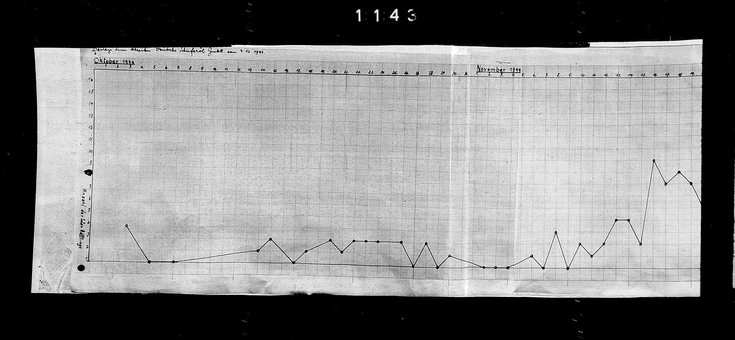
While many large charts seemed to have been developed for display in the courtroom, there are also many other charts in the evidence archive. I found dozens of thematic maps, line graphs, pie charts, and bar charts in evidence archives.
Below are two examples of these evidence.

As I relay these graphics, I hope to inspire not only a deeper appreciation for the power of charts during WWII but also an ongoing recognition of their dual capacity to inform or deceive across all areas of society.
Charts can be used for good. They’ve rallied abolitionists, suffragettes, healthcare reformers, Nazi-prosecutors, and climate-activists. But charts likewise aid the destruction of our earth and peoples. Charts aren’t good or bad, they’re just tools.
I hope that relaying these Nuremberg charts inspires further study of graphics across WWII, and a deeper appreciation for the power of charts.
Onward!—RJ
Thanks for reading. Chartography is an ad-free newsletter completely supported by readers like you. If this exploration of Nuremberg’s charts has piqued your interest, consider supporting my continued research into the profound impacts of data graphics by purchasing my books or becoming a paid subscriber.
About
Data storyteller RJ Andrews helps organizations solve high-stakes problems by using visual metaphors and information graphics: charts, diagrams, and maps. His passion is studying the history of information graphics to discover design insights. See more at infoWeTrust.com.
RJ’s recently published series, Information Graphic Visionaries, a new book series celebrating three spectacular data visualization creators. With new writing, complete visual catalogs, and discoveries never seen by the public. His first book is Info We Trust, How to Inspire the World with Data., is currently being remastered for a new edition.




Dude. Amazing.
These photos are incredible!!!