Welcome to Chartography.net — insights and delights from the world of data storytelling.
🍎 I am soon teaching Persuasive Data Graphics in-person at San Francisco’s fabulous Letterform Archive using original historic data graphics (and lots of modern digital ones too). Learn more and sign-up here.
Many information-design milestones are built on miserable data. Disease, violence, and so on. But it isn’t always so! Data graphics can also be silly, lighthearted, and in the word of Nigel Holmes: joyful.
I began collecting a fabulous library of rare information graphics in 2017. Here are my summer-fun highlights. Or if, like me, you think in showtunes: tragedy tomorrow, comedy tonight!
Dwiggins
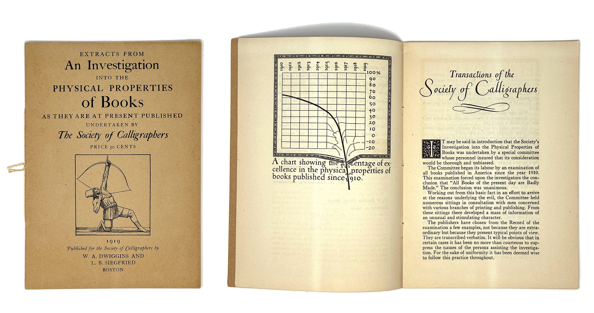
Extracts from an Investigation into the Physical Properties of Books (1919) opens with an iconic chartoon showing plummeting excellence in the quality of books. Note the extraordinary attention to the execution of this chart. Bent gridlines, busted frame, and scattered type really sell the metaphor.
Extracts attacked publishers, introduced radical designs, and included a series of interviews. The entire booklet was a professionally-packaged spoof, written entirely by Dwiggins and Siegfried.
W. A. Dwiggins (1880–1956) was one of the most prolific designers of his generation. From the fantastic Letterform Archive monograph (only 3 days left on its Kickstarter reprint!): “A master calligrapher, type designer, illustrator, private press printer, and a pioneer of advertising, magazine, and book design, Dwiggins was the quintessential maker—fabricating his own tools, mastering traditional skills, inventing new techniques, and experimenting with design in a wide range of passions and pursuits.”
Swift Dollar
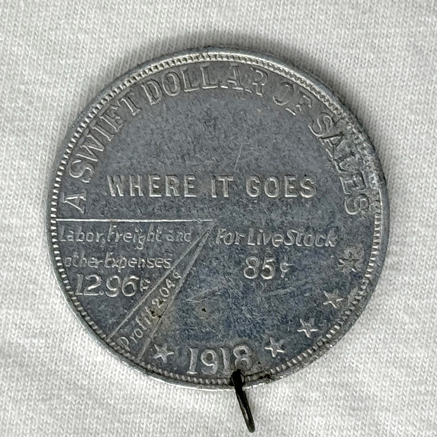
The Swift & Company meatpacking giant was an early target of Teddy Roosevelt’s trust-busting. Beginning in 1918, it promoted its operation using coin medallions. Each featured a pie chart that detailed “what becomes of the average dollar” from the sale of meat. This coin admits 2.04¢ profit per dollar of sales:
The next year’s six-volume Report of the Federal Trade Commission on the Meat Packing Industry (1919) cautions us against against trusting this pie chart blindly:
The packers’ accounts are so constructed that they conceal profits rather than reveal them. There are numerous “secret reserves” ; there are endless transfers of material from department to department at fictitious or arbitrary values; and there are all sort of improper items charged in as expenses, ranging from items properly chargeable to capital to improper payments which have no place in any business. To have untangled these accounts so that a complete presentation of profits and costs could be made would have required accountants and clerks as numerous as the several thousands employed by the packers.
In a later passage noting Swift, however, the FTC acknowledges the industry’s extraordinary efficiency—only a fraction of a cent net profit per pound—and enormous volumes. “The big packing industry is something for the country to be proud of.”
Neurath
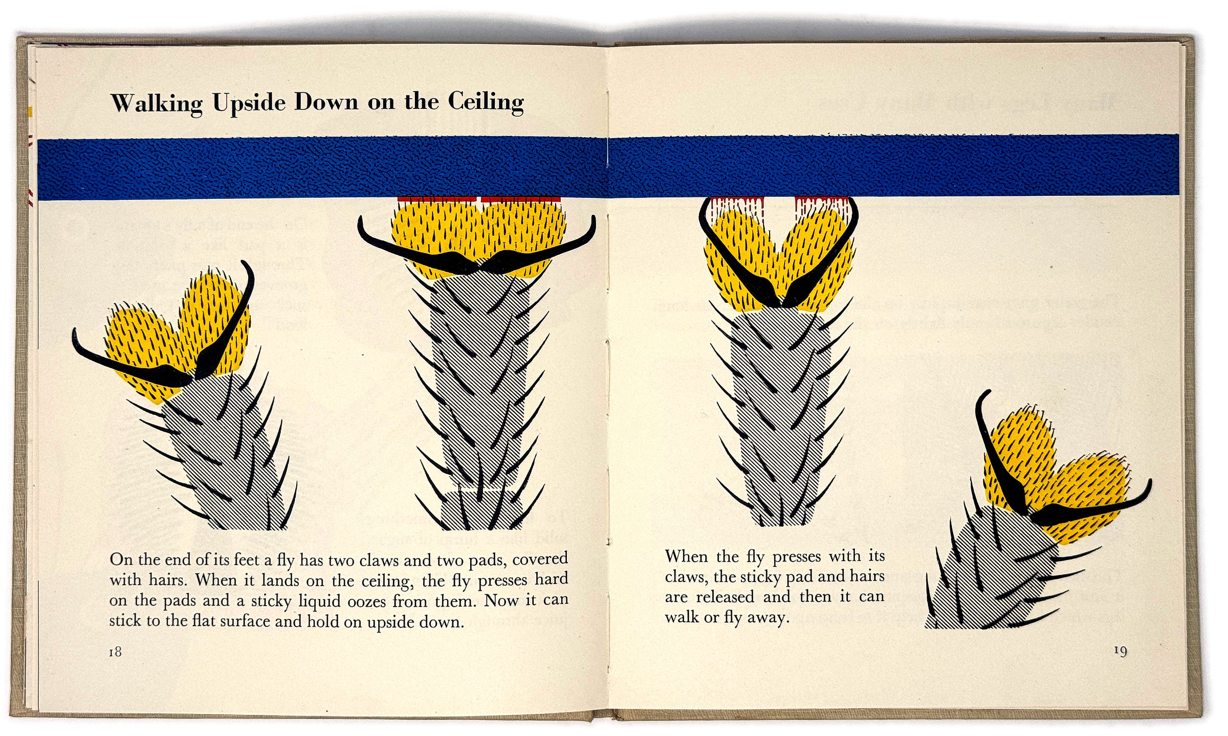
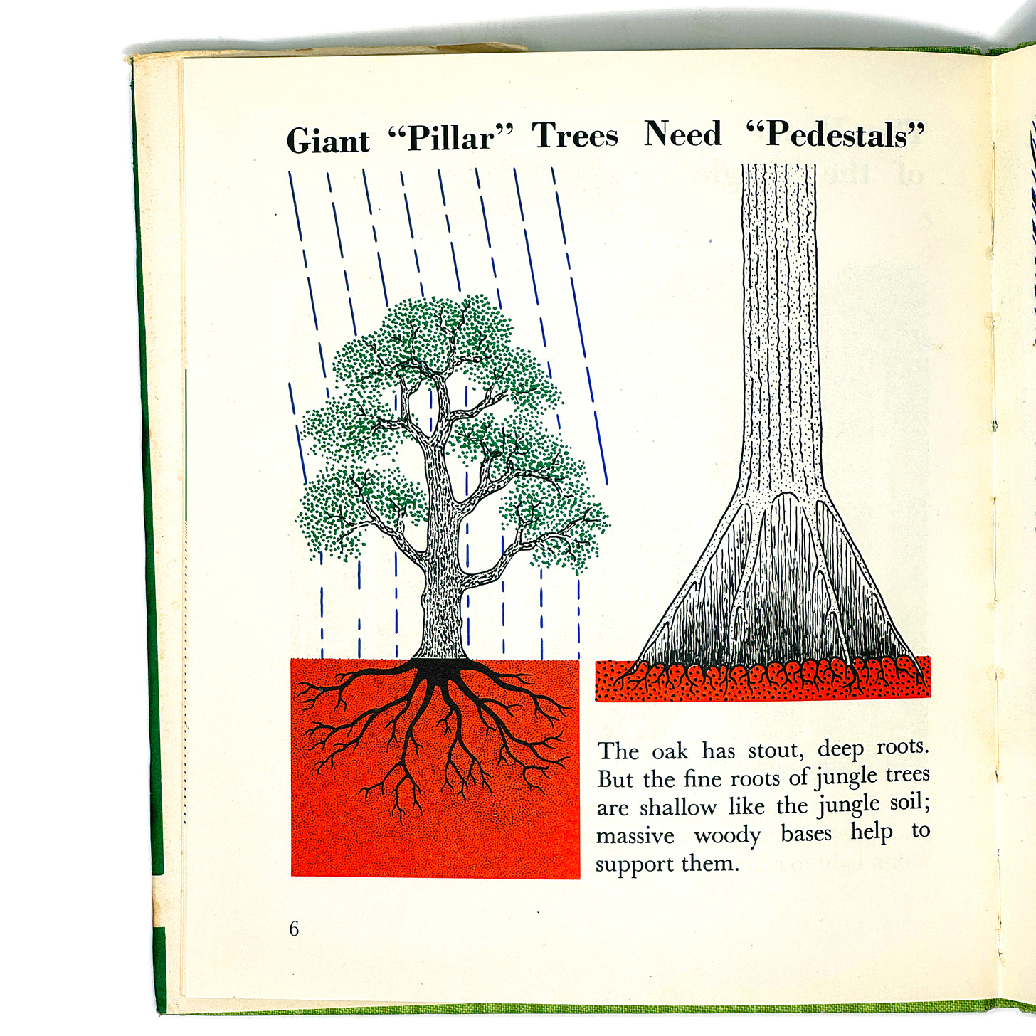
After the second world war, Marie Neurath produced a series of extraordinary picture books for children. Each explored a science or engineering topic with colorful flair.
Like Dwiggins, Neurath’s work is appreciated by the larger design community. (Making them very collectable!) And for good reason: Her bold colors, pattern work, and compositions are sublime.
I am lucky to have assembled a stack of her children’s books over they years. New acquisitions this summer are: Too Small to See (1956), Man-Made Moons (1960), and The Wonder World of the Jungle (1963).
Kahn
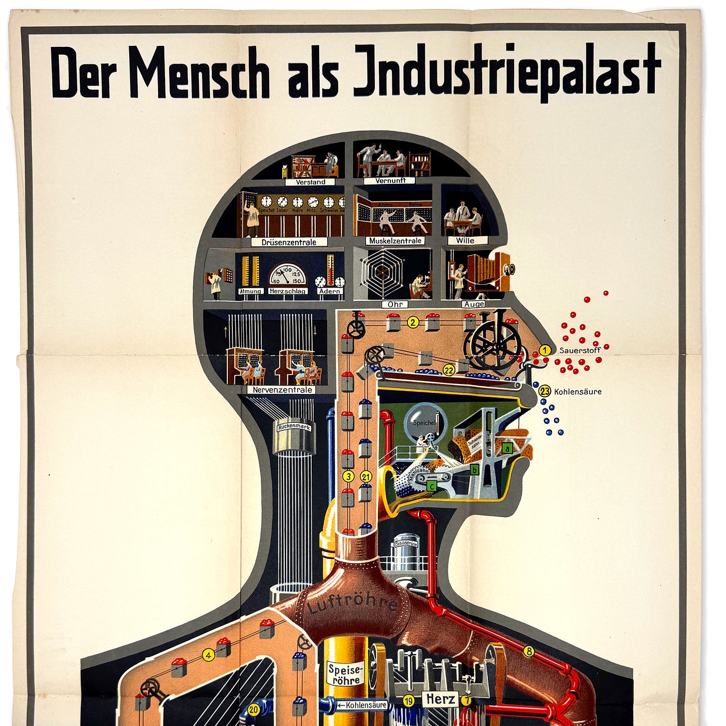
Today, Fritz Kahn is best known for his “Man as Industrial Palace” poster:
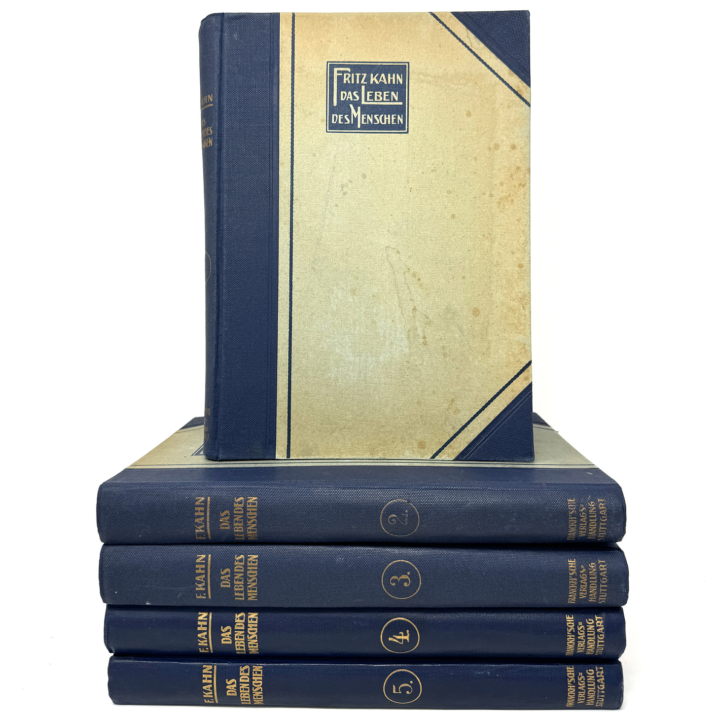
It’s one of a handful of foldouts from his 1920s five-volume series, Das Leben Des Menschen (The life of man).
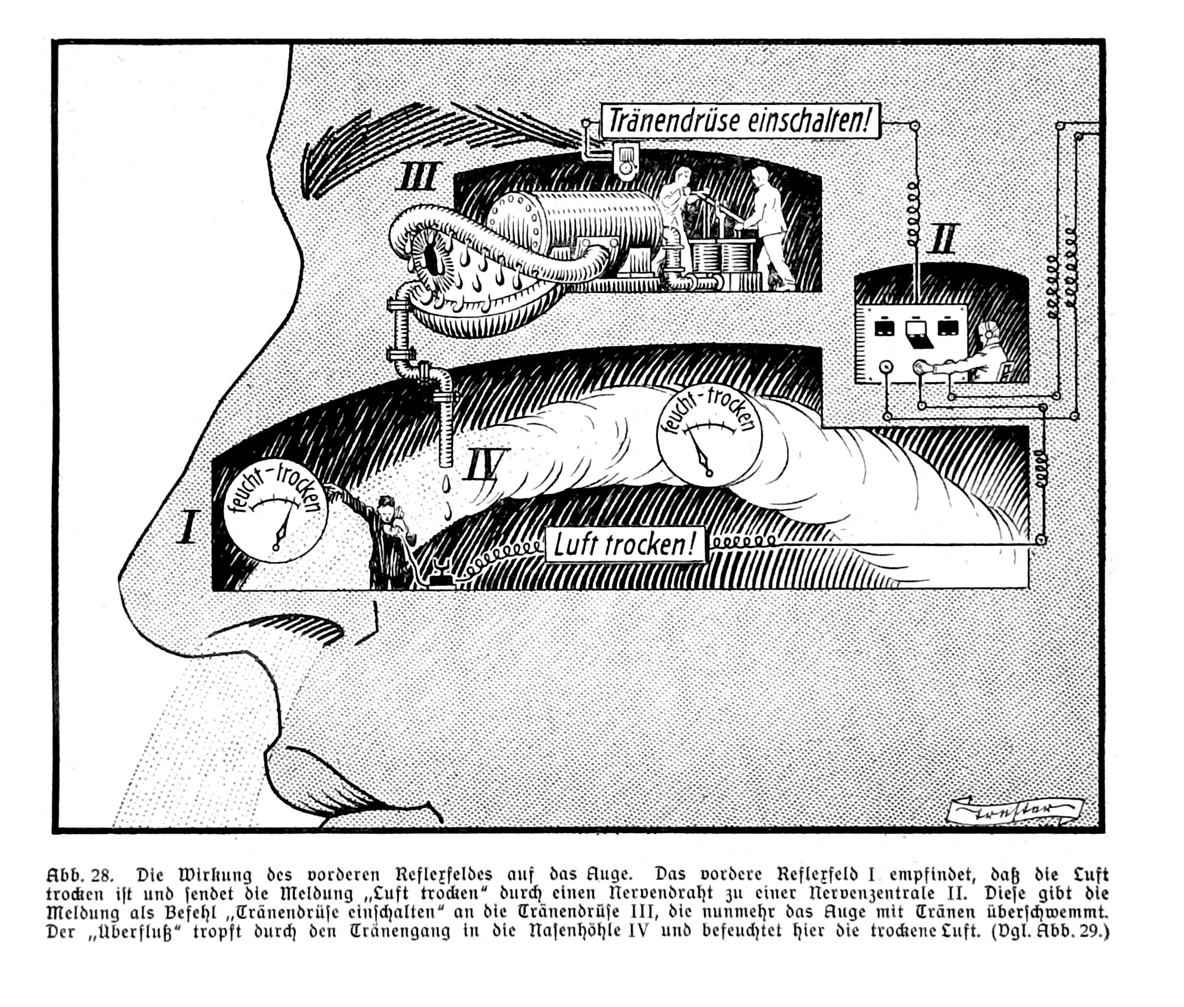
I associate Kahn depicting functions of the human body using factory metaphors. These are peppered through the volume, along with many more serious diagrams and lots of photography.
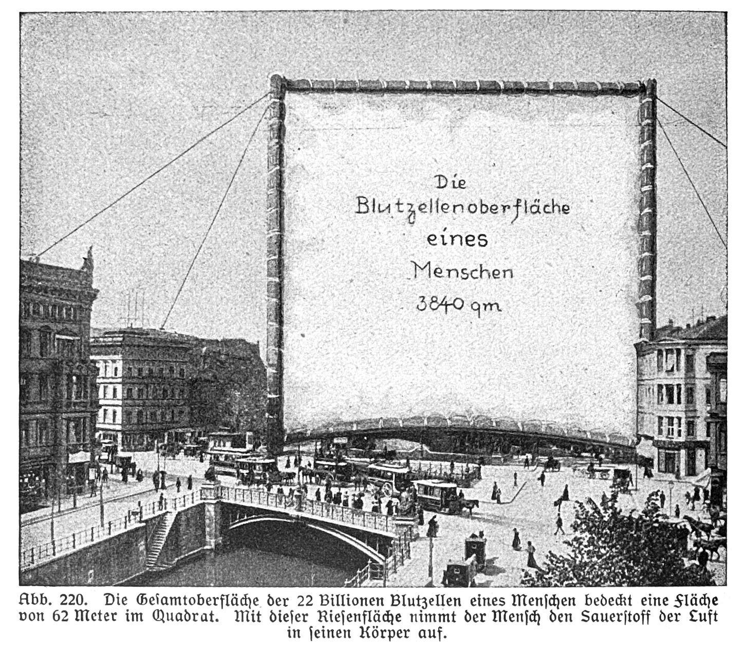
Below, the actual blood cell surface area of a single human is illustrated as an enormous billboard, looming over a city.
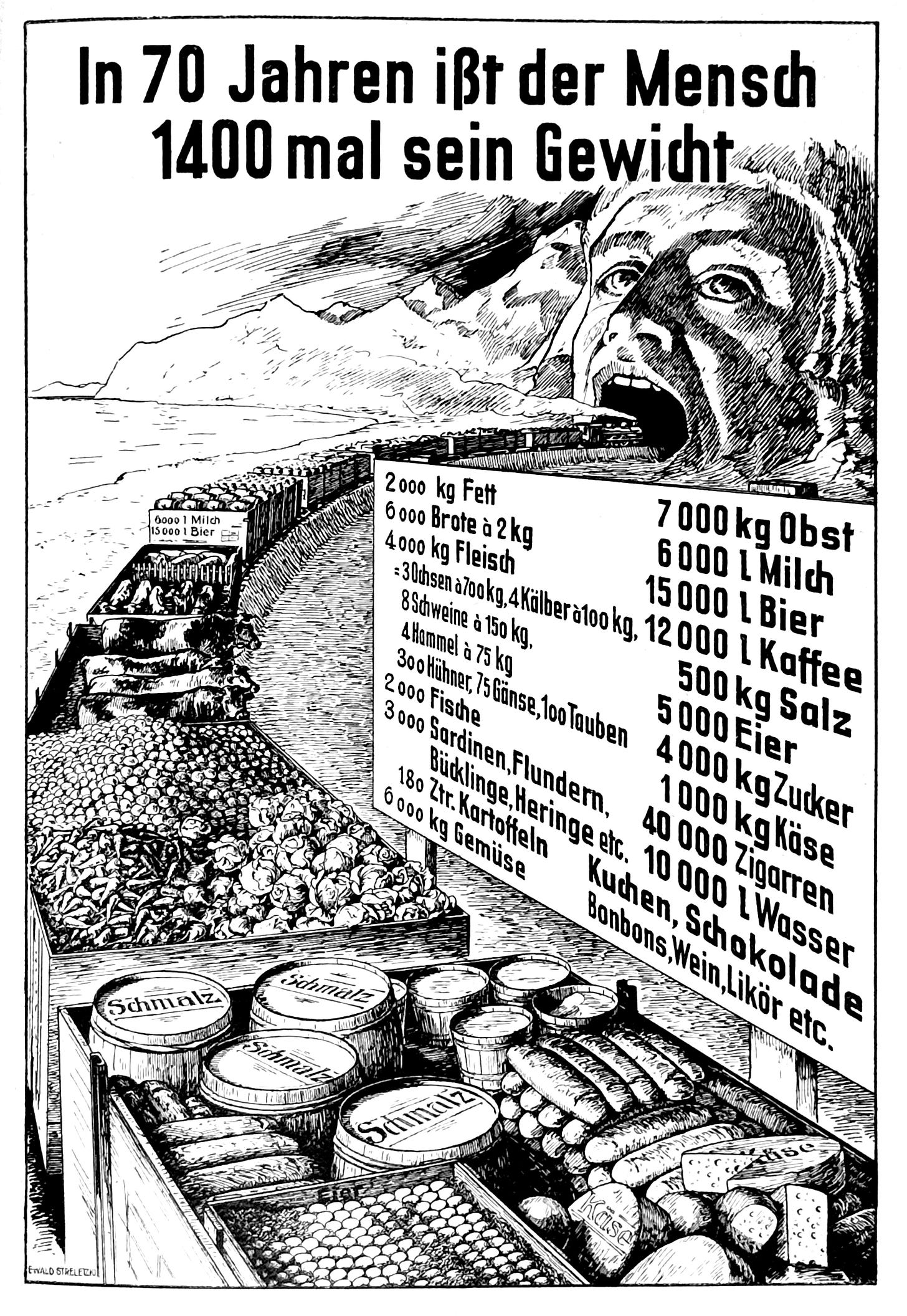
And here, a train tunnel tableau encourages us to consider how much food a person eats across their life.
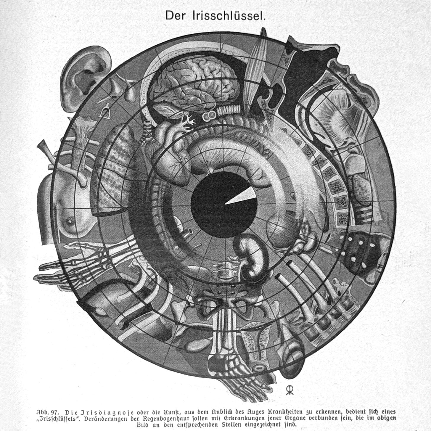
Below, a diagram shows which parts of the iris to read to (supposedly) discover the health of various parts of the body.
From Wikipedia:
Iridology is an alternative medicine technique whose proponents claim that patterns, colors, and other characteristics of the iris can be examined to determine information about a patient's systemic health. Practitioners match their observations to iris charts, which divide the iris into zones that correspond to specific parts of the human body. Iridologists see the eyes as "windows" into the body's state of health.
Across five volumes, there are thousands of images related to all manner of life, including plenty of graphic images of various pathologies, expressed with 1920s German sensitivity.
It was not easy to choose which images to highlight here. To see more, get the excellent Taschen volume on Fritz Kahn.
Holmes
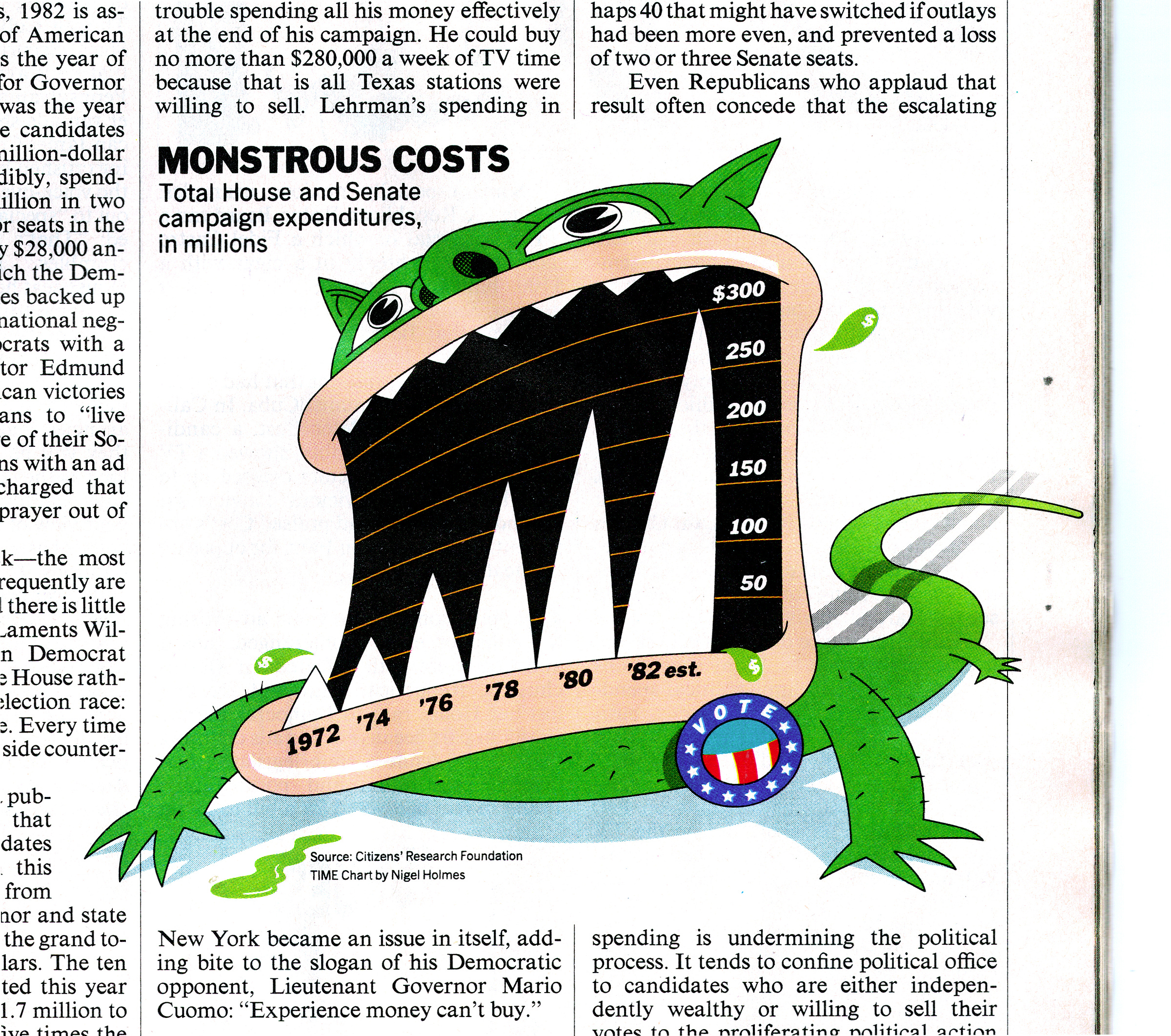
You may be surprised, like me, to see MONSTROUS COSTS, below, in green.
By Nigel Holmes for TIME magazine (November 15, 1982), a red and black variant of the monster was featured in his Designer’s Guide to Creating Charts & Diagrams (1984). That’s the more often-cited version. Don’t miss the dollar-sign tail. A design icon!
Back to School
Eventually, summer fun ends and we go back to class.
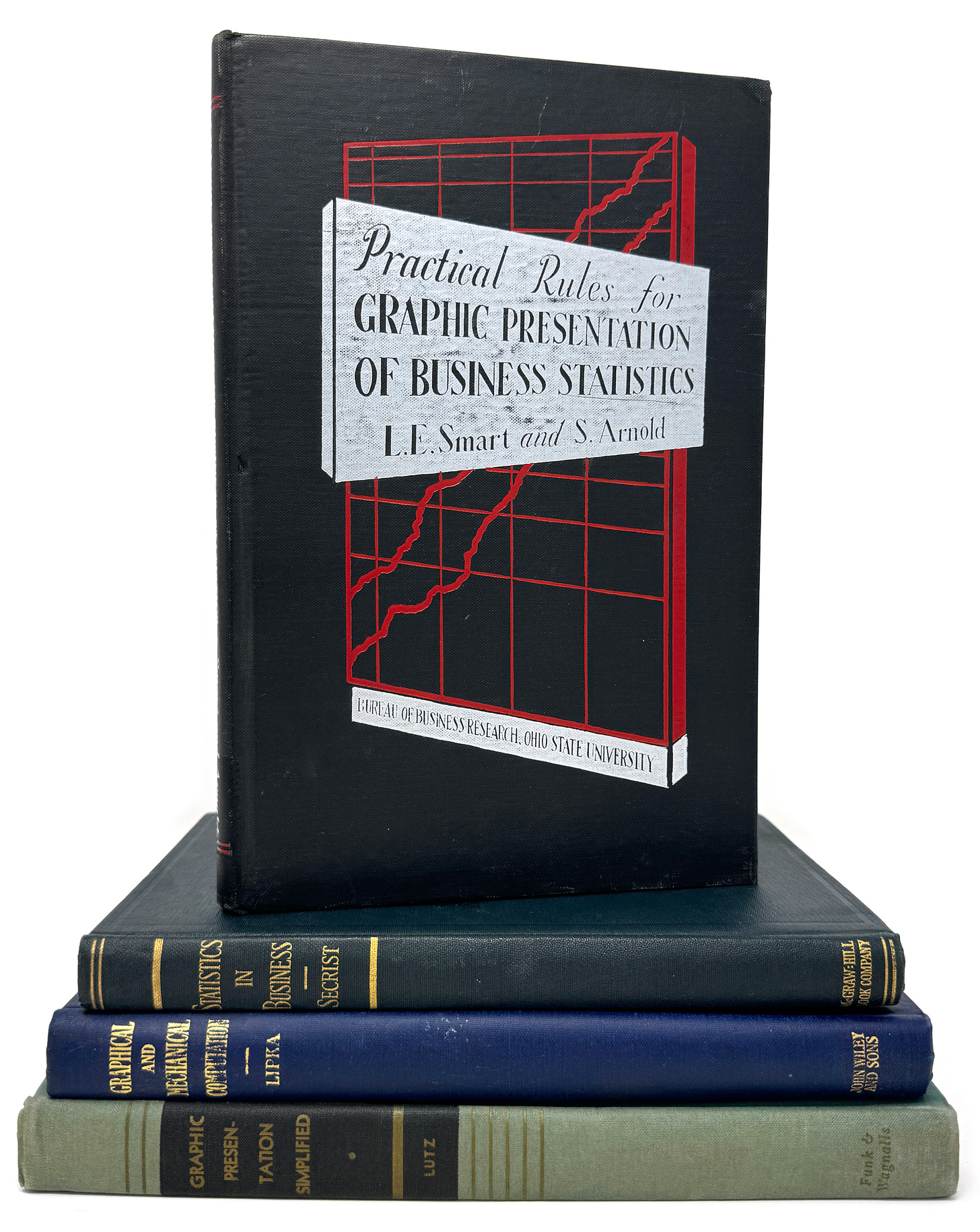
I have an obsession with early how-to textbooks about data visualization. Here are four recent additions:
How about that cover of Practical Rules?!
This is also the first year I have invested in conservation, restoring several fragile works with the help of talented specialists, including a package of 17th-century charts. That’s pretty old! More about them in a future edition.
Onward!—RJ
Info We Trust book update
📖 We just reviewed our book blanks and production proofs before my new book Info We Trust Remastered goes to print. The physical book feels great in your hand—a book to be read, not merely stared at. I expect to have an updated timeline for its arrival soon. Reserve your copy directly from Visionary Press.
About
RJ Andrews helps organizations solve high-stakes problems by using visual metaphors and information graphics: charts, diagrams, and maps. His passion is studying the history of information graphics to discover design insights. See more at infoWeTrust.com.
RJ’s next book, Info We Trust, is currently available for pre-order. He published Information Graphic Visionaries, a book series celebrating three spectacular data visualization creators in 2022 with new writing, complete visual catalogs, and discoveries never seen by the public.


Der Irisschlüssel diagram!
I absolutely love the Swift dollar!! Your newsletters are always a treasure trove of historical data viz goodness ☺️